Assess Data Quality
Working with the tool to discover data quality issues
Overview
This guide will walk you through our suggested workflow for getting started on analyzing your dataset in order to find labeling issues and model performance issues. You'll find step-by-step instructions on how to navigate through Aquarium's interface and some tips and best practices on how to best understand your data.
An ML model is only as good as the data it's trained on. Most gains to model performance come from improving datasets rather than model code. At times, it can be hard to make significant gains in the code without large time investments. As a result, ML teams spend a majority of their time iterating on their datasets.
Aquarium takes a data-centric approach to helping your team assess the quality of your datasets. Bad data hurts model performance and invalidates accuracy metrics. And because of this, Aquarium allows your team to:
Visually inspect your data to find data quality issues,
Collaborate with other team members
Speed up iteration cycles with your labeling providers
This guide walks you through a core workflow using a 2D Object Detection example using data from the open-source RarePlanes dataset. This dataset consists of satellite imagery of planes on a variety of runways classified by their wingtype. For other types of ML tasks (classification, segmentation, etc.), the steps should be similar, but some steps might differ slightly.
Once completed you should feel comfortable:
Strategically navigate the Model Metrics View page to identifying bad labels and poor model performance
Creating segments from the Model Metrics View
Before You Begin
In order to move through to workflow to assess data quality, you will need to have completed the following:
We will use the labeled dataset and inference set to compare model results to the ground truth in order to find areas of interest within our data.
For this guide, we are working with only one inference set. Make sure that you have properly selected a labeled dataset and an inference set at the top of your viewing window in order to properly follow along.
Assessing Your Data Quality
With your dataset and inference set uploaded, let's get started!
With inferences available, the Model Metrics View is an easy way to review confusion results for your data and an easy first step in evaluating your data quality. Starting here will allow us to interact with a confusion matrix to help us easily identify and determine if errors in your results were due to labeling or model performance.
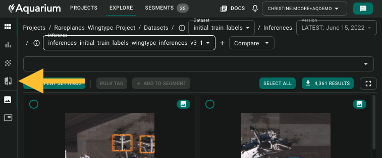
1. Navigate To Model Metrics View
2. Adjust Metrics Settings
This guide is aimed specifically at surfacing labelling issue and model failure patterns. We will not cover every button and feature on the Model Metrics View page. For a detailed overview of everything on screen in the Model Metrics view, look here.
The first thing we will do is adjust the confidence threshold and IOU threshold.
IOU stand for Intersection over Union - a metric used to evaluate model performance by estimating how well a predicted mask or bounding box overlaps with the ground truth mask or bounding box
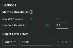
With a low IOU (to 0.1), we can filter examples where the labels and inferences don't overlap well. By combining a low IOU with a high confidence like 0.8, the resulting images will reflect where the model detected an object in high confidence with no labels present helping us discover labeling errors.
To do this, click Metrics Settings button in the top right corner of your view window and adjust your IOU to 0.1 and confidence to 0.8. You can set threshold with slider, incremental arrows, or typing in your value.
3. Interacting and Reviewing Confusion Matrix Results
For this guide, we'll focus on filtering results by two categories of confusion: all false positives and all classification disagreements (there WAS a label, and the inference was a different class than the label).
In this view, you'll see two matrices. The one on the left presents different metrics for each of your authoritative classes as well as a weighted average. The one on the right is a traditional confusion matrix that is interactive.
There are many ways to view your data in the Model Metrics View, and we encourage you to explore them here!
Filtering For All False Positive Confusions
We'll start with the buttons in the top left of the viewing window.
When you click on any of these buttons, they will highlight corresponding cells in the confusion matrix and return data that matches the criteria of the highlighted cells down below the matrices.
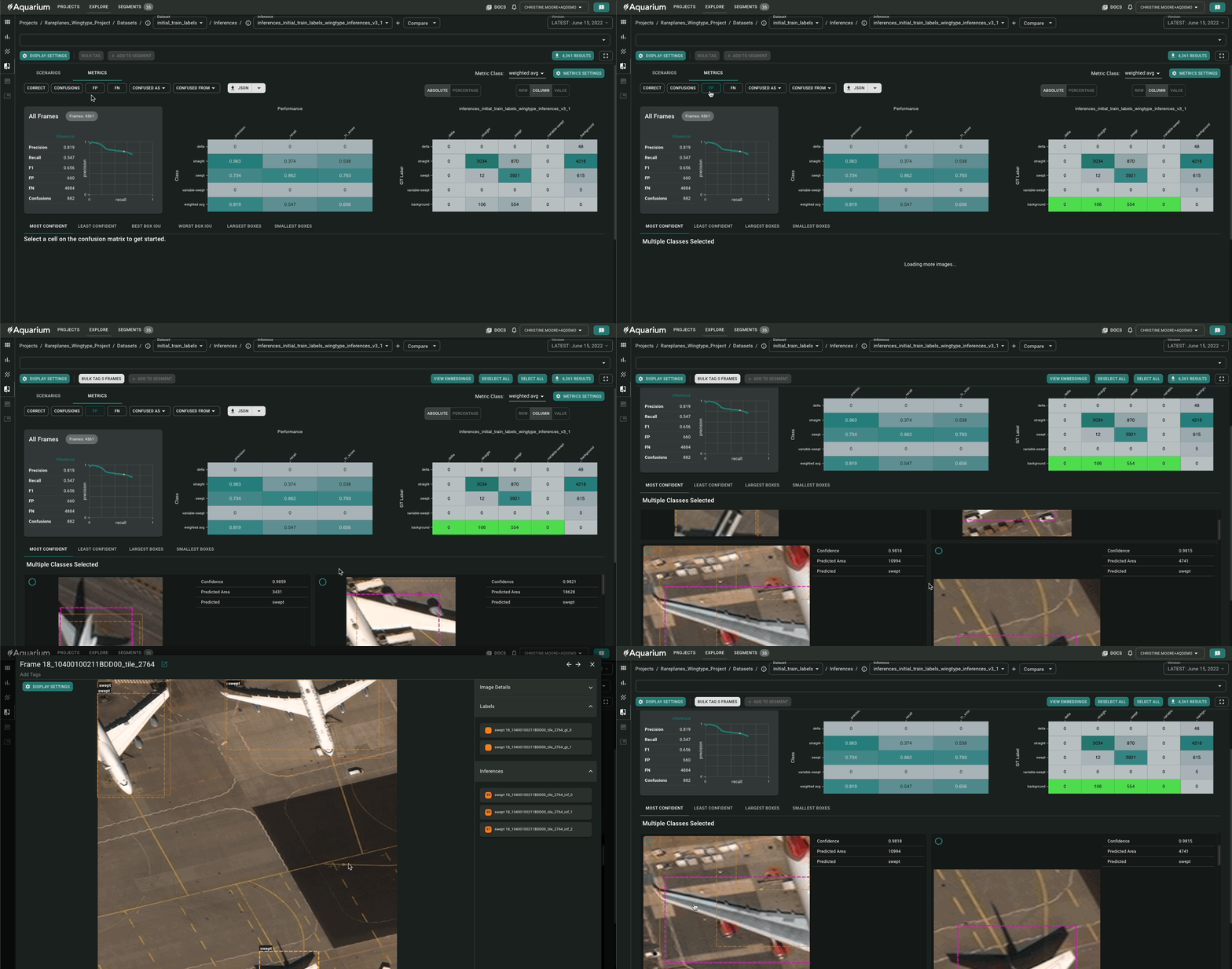
To filter by False Positives, click the button that says "FP" first. When you click the button you'll notice parts of your confusion matrix highlighted in a neon green color and examples of your data where the labeled class did not match the inferred class populate down below.
Understanding the Returned Results - False Positives
Filtering by FPs is particularly helpful in finding bad labels because it reveals areas that the model was confident there was an object of importance but there is no corresponding label present.
So it's likely that you'll see results that should have been labeled but were not.
For this example dataset, each result will have labels and inferences indicated on the image if present. Labeled bounding boxes have a solid line, while inferences have a dotted line. Each bounding box is a unique color depending on the classification.
Once you have clicked the FP button, images that were not properly labeled should surface rather quickly, because you'll find examples with just dotted lines for bounding boxes and non-corresponding labels!
For example, the image below is a result that surfaced where the model was able to pick up that the tail of plane was present, but the plane was not labeled properly. In this case, it wasn't labeled at all!
Another common type of failure you may see is an inference that is much smaller or larger than the actual label such that the overlap between the bounding boxes is minimal. These kinds of results are great examples of where the model is struggling.
Filtering All Confusions
We just walked through how to view results from the confusion matrix by filtering for FPs, now we'll repeat the same process but for Confusions. With regard to the results, filtering by Confusions does not return any false positives or negatives, only results where there was a ground truth label that was classified differently than the model inference.
Just like we did for false positives, click on the Confusions button in the top left corner of the view:
Understanding the Returned Results - Confusions
Filtering by Confusions is particularly helpful in examples of poor model performance. With a high confidence filter, the results will show trends and patterns where the model classified a detected object differently than the expected label.
This is also a great way to help determine if the labels are correct. For example, the model could be right in classifying a detected object, the labeler actually just made a mistake in a specific edge case. You can use Aquarium to then collect these examples for relabeling.
Reviewing Specific Cells of Confusion
You are able to directly click on a cell in the matrix, and down below resulting data will populate that meets the criteria of the selected cell.
Reviewing at the cell level can be helpful for understanding where labeling guidelines may have been off, or understanding patterns of failure. For example, in the examples objects with common characteristics may commonly show the same misclassifications. In this case, relabeling or updating labeling guidelines would yield better model performance.
Or conversely, the model was wrong with its predictions and you may need to gather more examples of objects with those characteristics to add to your training set in order to improve performance.
Toggling the Tabs in the Review Window
Regardless of if you used a button to apply a larger filter or you clicked on a particular cell, you can toggle between the tabs that
Depending on the tab, your results will be ordered differently and can help you surface interesting failure cases in your data.
4. Add Interesting Data To A Segment
For a comprehensive overview of segments and the different kinds, please refer to this guide.
Once you have located examples in your returned results that are problematic and you would like to track, we can take advantage a feature within Aquarium called Segments. Segments allow us to meaningfully group our data in order to move through subsequent workflows like exporting data back to a labeling provider, reworking labeling guidelines, or using the data to search for similar examples in an unlabeled dataset to eventually expand a training dataset.
To add data to a segment from the Model Metrics view, first you need to select which data you would like to add!
You can either click each returned result individually:
Or you can use the Select All and Deselect All buttons to speed up the process:
After clicking Add To Segment, you can add your collected results into an existing segment or create a new segment. The kind of segment you choose is up to you and the workflows you have planned with the collected data. Please refer to this guide for more detail about each kind of segment, but in general:
Collection Campaign Segments - Add your confusion matrix results here if you would eventually like to search through unlabeled data to find similar example for later expanding the training set
Data Organization Segments - Creates a bucket for your results that can be used to export element data or a holding area until the next workflow is decided
Data Quality Segment - Good holding place for your collected results if there are label issues or issues with the actual data, can export to labeling providers for relabel
Last updated